When I need to check for the availability of airline tickets, I usually gravitate to ClearTrip. The interface is clean, there isn’t too much clutter, and compared to the other sites the simplicity is beautiful.
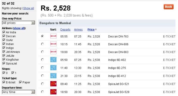
The results are also displayed in a way (see below) that makes sense to customers and not in an airline-friendly way. The results are sorted by price and the result selected shows you a break-up of the price. (For e.g.: Rs. 2,528 = Rs. 500 + Rs. 2,028 taxes & fees, if the image is not clear).
I’ve been to sites that will show you the price without taxes and then after you select a price, they’ll “surprise” you in the next page. This is such a breath of fresh air.
ClearTrip’s tagline is Making Travel Simple and even their About page talks about this:
Simple: Simplicity is a religion at Cleartrip. If we’re not the not the easiest place to search and book your travel, feel free to give us a piece of your mind.
Even if you don’t want to book a ticket, go and check out the design of the website to see what I’ve been blathering about. I wish more sites would realise that less is more.
PS: I have no affiliations with ClearTrip at the time of writing. If they wish to reward me for pushing up their stock price after this post, however, I have no qualms about accepting a seat on their board. Or a free air ticket.

Excellent layout! :-) Thanks for the tip. I guess I know where I should be going if I need to book my tickets online.
Yeah, and if they ask you who sent you there, mention my name and ask them to give me stocks ;-).
I checked out ClearTrip and it’s definitely more usable than the other one you linked to. ClearTrip’s interface makes it real easy to pick a destination; the important information is in text-links ( ‘Current Offers’) and the ‘Search’ form takes you to where you want to go in five steps or less. These folks definitely know what they’re doing! Brilliant.
Suffian: Yeah, it’s nice to come across a website which really makes you enjoy the interaction. It looks like they did think about the user during their design.